Redesigning Seniority’s Mobile App: A Case Study
Story of what went behind revamping the ordering experience from the Seniority app.
INDUSTRY
Healthcare
E-commerce
TIMELINE
2 Weeks
MY ROLE
Solo Designer
SERVICES
Visual Design
UI & UX Design
THE PROJECT
Redesigning an app where senior adults can get health and lifestyle products.
I’ve worked on a lot and a wide variety of projects at HCAH. A few small ones, a few big ones, and a few massive ones. In this case study, I will talk about one of my massive projects which also happens to be one of my favourite ones. I was the sole designer who owned this project and worked on it from start to finish.
THE PROBLEM
“How might we improve the search and checkout experience to increase orders from the app?”
THE SOLUTION

WHY THE REDESIGN?
The old app failed to deliver a tailored experience and offered subpar usability.
Mobile Dominance in E-commerce
About 79% of Indian consumers favour mobile apps for e-commerce (Zippia), which presents a significant opportunity for Seniority to serve its user base.
Ageing Population's Mobile Adoption
The growing trend of seniors embracing mobile technology for shopping demands a more accessible design. It’s called Senior-ity for a reason. Right?
Personalisation and Engagement
Lack of customisation limits user engagement. A redesigned app can offer personalised recommendations, promotions, notifications and much more.
Performance Optimization
Technical issues like slow loading and crashes hinder user experience when using the app. Optimisation efforts will greatly enhance stability and reliability.
THE RESEARCH
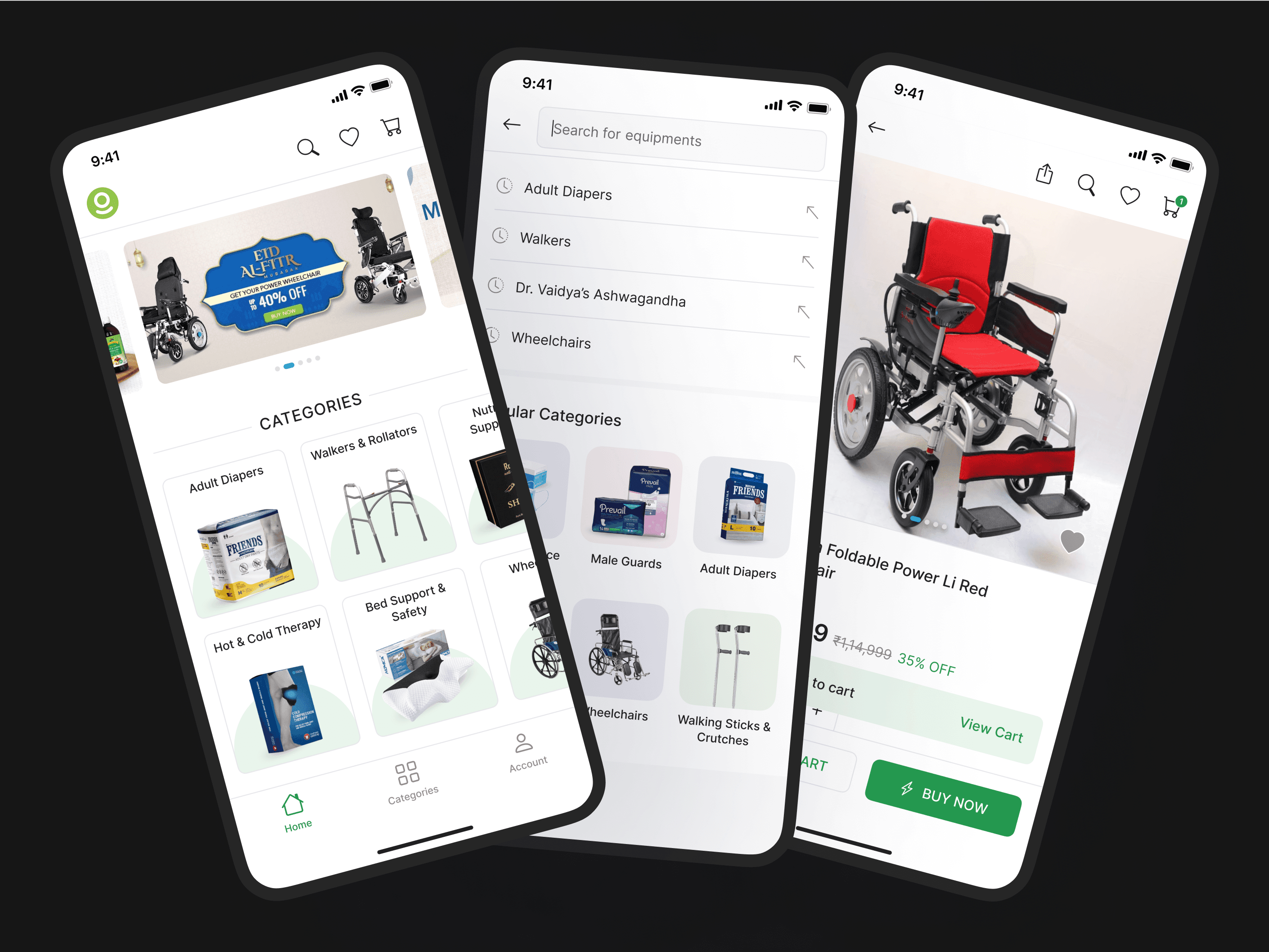
The app NAVIGATION, item EXPLORATION and order COMPLETION are poor.
To identify other problems and the things that were working well for us, I noted down everything that I could gather from support tickets, user interviews, session recordings and by looking at the data.
Here are some of the key findings and common pain points, and in this case study I’m going to elaborate on them-
Visual Clutter on Home Page
Exploring the catalogue was a tedious task because of all the different visual elements.
Difficulty in Searching Items
What should have been the bread and butter for an e-com app, became a hassle for the users.
Poor Checkout Experience
"Unexpected costs", "Lack of Trust", & "Extra Steps" were some of the feedback points from users.
COMPETITIVE ANALYSIS
Identified common design patterns used by top e-commerce brands.
I studied the user flow of all kinds of shopping/booking websites, be it hotel booking, e-commerce, quick commerce etc., to better understand a user's decision-making factors. Some of the websites were:
Although these platforms share similarities in terms of functionality, they still differ in the way they shape search and shopping experiences.
SUB-PROBLEM 1
“How might we make navigation and exploration easier to reduce bounce rate?”
SOLUTION
Solving for known issues- The aim here was to solve some known issues and keep what was working well for us.


Solving Scalability Issue- Created some other sections that can be used as templates by the Catalogue Manager to replace content dynamically from the backend.

Solving Exploration Issue- Added a separate tab of Categories in the bottom navigation for easier reachability.


